Layouts in Jetpack Compose
Compose by example
https://www.youtube.com/watch?v=DDd6IOlH3io&feature=emb_imp_woyt&ab_channel=AndroidDevelopers
https://github.com/android/compose-samples
compose를 사용한 공식적인 예제 앱들로 설명
Themeing
Layouts in Jetpack Compose
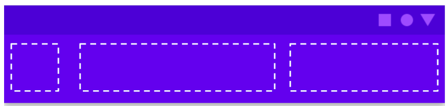
Slot APIs
Slot APIs는 customization(맞춤화) 레이어를 composable 위에 가져오기위해 Compose에서 도입한 패턴이다.
Material Button을 생각해보면, Button의 모양과 내용에 대한 가이드라인이 있음.
그러나 종종 원하는것을 구현하기위해 컴포넌트들을 커스텀해야하는 경우가 있음, 커스텀을 위해 파라미터를 추가하면 추가할수록, 통제할 수 없어짐
컴포넌트 커스텀을 위해 여러 파라미터를 추가하는 대신에, 우리는 Slots을 추가했음
Slot은 개발자가 원하는 대로 채울 수 있도록 UI에 빈공간을 남겨둠
예를 들어서 Button 케이스에서, 아이콘과 텍스트가 있는 행을 삽입하려는 사용자가 Button 내부를 채울 수 있음
이를 가능하게 하기 위해서, 자식 composable 람다를 받는 Button API를 제공 함(content: @Composable () -> Unit)
이는 Button에서 내가 정의한 compsable을 emitted할 수 있도록 함
@Composable
fun Button(
	modifier: Modifier = Modifier.None,
  onclick: (() -> Unit)? = null,
  ...
  content: @Composable () -> Unit
)
Compose 에서는 Top App Bar같은 복잡한 구조에서 Slot을 헤비하게 사용하고 있음

타이틀을 포함해서 많은 항목들을 커스텀할 수 있음
예시
TopAppBar(
	title = {
    Text(text = "title", maxLines = 2)
  },
  navigationIcon = {
    Icon(myNavIcon)
  }
)
own 컴포저블을 만들때, Slots API 패턴을 사용해서 more reusuable 하게 만들 수 있음
Material Components
Compose는 앱을 만들 때 사용할 수 있는 Material Component Composable과 함께 제공된다.
가장 high-level composable은 Scaffold 이다.
Scaffold
Scaffold 는 기본적인 Material Design layout구조를 가지고 UI를 만들 수 있게 해줌.
TopAppBar, BottomAppBar, FAB, Drawer 같은 가장 흔한 top-level 머터리얼 컴포넌트들의 slot을 제공함
Placing modifiers
새로운 composable을 만들 때 마다, Modifier 를 디폴트로 가지는 modifier 파라미터를 가지는 것은 composable을 재사용 할 수 있게만드는 좋은 방법이다.
BodyContent Composable은 이미 modifier를 파라미터로 가지고 있다. 만약 extra padding을 BodyContent에 추가하고 싶다면, padding modifier는 어디에 두어야 할까?
두가지 방법이 가능하다 :
-
modifier를 컴포저블 내 direct child에만 적용하면 모든
BydyConent호출에 extra padding 이 적용 됨@Composable fun BodyContent(modifier: Modifier = Modifier) { Column(modifier = modifier.padding(8.dp)) { Text(text = "Hi there!") } } -
필요할때에만 extra 패딩을 추가하는 composable을 호출할때에만 modifier를 적용
@Composable
fun LayoutsCodelab() {
  Scaffold(...) { innerPadding ->
  	BodyContent(Modifier.padding(innerPadding).padding(8.dp))
  }
}
어디서 적용할 것인지는 composable의 타입과 유즈 케이스에 따라 다르다.
Modifiers can be chained by calling each successive modifier function on the previous one.
가능한 체이닝 메서드가 없다면 .then() 을 사용해라.
Create your custon layout
수동으로 childern을 measure & 배치 해야 할 수 있음, 이때는 Layout composable을 사용
기존의 View System에서는 cusom layout을 만드려면. Viewgroup을 extend하고 meaure와 layout 함수들을 구현해야 함. Compose에서는 Layout composable을 사용해서 간단하게 함수를 작성하면 됨
커스텀 레이아웃을 작성하는 방법을 알아보기 전에, Compose에서 Layout의 원칙에 대해 알아야 함
Principles of layout in Compose
Some composable functions emit a piece of UI when invoked that is added to a UI tree that will get rendered on the screen. 각 emission(or element)는 하나의 parent와 잠재적인 많은 children을 가짐. 또한 parent내에서의 location: (x,y)position 과 크기: width , height 를 가짐
Compose UI는 multi-pass measurement를 허락하지 않는다.
- layout element가 다른 measurement configuration을 위해 두번이상 자식을 측정할 수 없음을 의미
- 성능에 좋음
Using the layout modifier
element의 measure와 배치를 컨트롤하기위해 layout 모디파이어를 사용
보통 custom layout modifier 구조는 다음과 같음
fun Modifier.custonLayoutModifier(...) = Modifier.layout { measurable, constraints
  ...
}
layout 모디파이어를 사용하면, 두가지 람다 파라미터를 얻음
measurable: 측정되고 배치될 자식constraints: 자식의 최소, 최대 width와 height
만약 base line 부터 top까지의 거리를 조정하고 싶다면. layout 모디파이어를 사용해서 composable을 배치 해야함
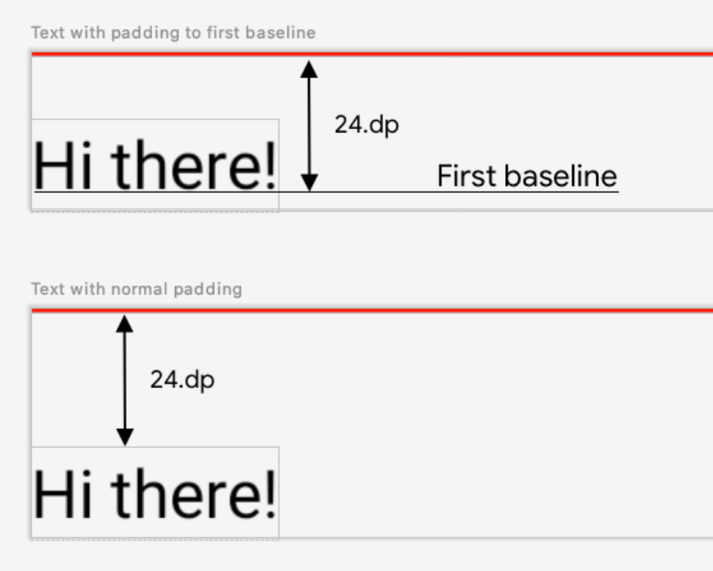
firstBaselineToTop modifier를 만들어보자
fun Modifier.firstBaselineToTop(
	firstBaselineToTop: Dp
) = Modifier.layout { measurable, constraints ->

}
첫번째로 composable을 measure해야 함. 이전에 언급한 것 처럼 자식은 오직 한번만 measure할 수 있음
measurable.measure(constraint) 를 호출해서 composable을 measure한다. measure() 호출의 결과는 placeRelative(x,y) 를 호출해 배치될 수 있는Placeable 임
composable이 measure된 이후에, 그것의 사이즈를 측정하고 content를 배치하기 위해 람다를 받는 layout(width, height)을 호출해서 명시해야함
fun Modifier.firstBaselineToTop(
	firstBaselineToTop: Dp
) = Modifier.layout { mearusable, constarints ->
  val placeble = measurable.measure(constrains)

  // Check the composable has a first baseline
  check(placeable[FirstBaseline] != AlignmentLine.Unspecified)
  val firstBaseline = placeable[FirstBaseline]

  // Height of the composable with padding - first baseline
  val placeableY = firstBaselineToTop.toIntPx() - firstBaseline
  val height = placeable.height + placeableY
  layout(placeable.width, height) {
    // composable이 배치되는 위치
    placeable.placeRelative(0, placeableY)
  }
}
이제는 placeable.placeRelative(x,y)를 호출해서 composable을 배치할 수 있음
Using the Layout compsable
single composable이 measure되고 화면에 배치되는 방식을 컨트롤하는 대신에, Composable들의 그룹에 대해 동일한 필요성이 있을 수 있음. 이를 위해 Layout composable을 사용하여 layout의 자식을 measure하고 배치하는 방법을 수동으로 컨트롤할 수 있음
@Composable
fun CustomLayout(
	modifier: Modifier = Modifier,
  // custom layout attributes
  children: @Composable () -> Unit
) {
  Layout(
  	modifier = modifier,
    children = children
  ) { mearurable, constraints ->

  }
}
Layout 을 이용해 매우 기본적인 Column 을 구현해보겠음
Implementing a basic Column
@Composable
fun MyOwnColumn(
    modifier: Modifier = Modifier,
    children: @Composable () -> Unit
) {
    Layout(
        modifier = modifier,
        children = children
    ) { measurables, constraints ->
        // Don't constrain child views further, measure them with given constraints
        val placeables = measurables.map { measurable ->
            measurable.measure(constraints)
        }

        // 자식을 수직으로 배치하기 위해 기록
        var yPosition = 0

       	// layout(width, height)를 호출해서 our own Column사이즈를 지정하면,
        // 자식을 배치하는데 사용되는 람다도 제공함
        layout(constraints.maxWidth, constraints.maxHeight) {
            // Place children in the parent layout
            placeables.forEach { placeable ->
                // 화면에 아이템을 배치
                placeable.placeRelative(x = 0, y = yPosition)

                // Record the y co-ord placed up to
                yPosition += placeable.height
            }
        }
    }
}
Complex custom layout
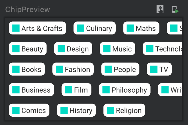
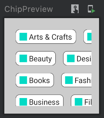
Owl 예제 앱의 staggered grid layout을 만들어 볼 것

Owl의 staggered gird 는 아이템을 수직으로 배치하고 n개의 row로 colum을 채움
custom layout을 사용하면 staggered grid에 있는 모든 아이템의 높이를 제한할 수 있음
다른 orientation에서 gird를 재활용하려면, 화면에 표시할 row의 갯수를 파라미터로 받아야 함
@Composable
fun StaggeredGrid(
	modifier: Modifier = Modifier,
  rows: Int = 3,
  children: @Composable () -> Unit
) {
  Layout(
  	modifier = modifier,
    children = children
  ) { measurables, constraints ->
    // 주어진 constrains로 자식을 measure하고 배치하는 로직은 여기 들어감
  }
}
첫 번째로 할 일은 자식을 measure하는 것, 자식은 오직 한번만 measure 할 수 있음을 기억
이 예시에서는, we won’t constrain our child views further. 자식을 measure 할때, 반드시 각 row의 width 와 max height 를 추적해야함.
Layout(
	children = children,
  modifier = modifier
) { measurable, constraints ->
   val rowWidths = IntArray(rows) { 0 }  // 각 row의 width를 저장
   val rowMaxHeight = IntArray(rows) { 0 } // 각 row의 max height를 저장

   // Don't constrain child view further, 주어진 constraint로 child를 measure
   // measured된 children 리스트
   val placeables = mewaurables.mapIndexed { index, measurable ->
     // 각 child를 measure
     val placeable = measurable.measure(constraints)

     // 각 row의 width와 max height를 저장
     val row = index % rows
     rowWidths[row] = rowWidths[row] + placeable.width.value
     rowMaxHeights[row] = kotlin.math.max(rowMaxHeights[row], placeable.height.value)

     placeable
   }
}
이제 로직 내에 measure된 chidren 리스트가 있음, 화면에 배치하기 전에 gird 크기를 측정해야 함
이미 각 row의 maximum height를 알고 있기 때문에, Y 위치에서 각 row에 대한 위치를 계산할 수 있음
Y 위치를 rowY 변수에 저장
Layout(
    children = children,
    modifier = modifier
) { measurables, constraints ->
    ...

    // 그리드의 너비는 가장 긴 row의 너비
    val width = rowWidths.maxOrNull()
        ?.coerceIn(constraints.minWidth.rangeTo(constraints.maxWidth)) ?: constraints.minWidth

    // 그리드의 높이는 각 row의 가장 큰 element들의 합
    val height = rowMaxHeights.sumBy { it }
        .coerceIn(constraints.minHeight.rangeTo(constraints.maxHeight))

    // 이전 행의 높이의 누적을 기반으로 한 각 row의 Y 위치
    val rowY = IntArray(rows) { 0 }
    for (i in 1 until rows) {
        rowY[i] = rowY[i-1] + rowMaxHeights[i-1]
    }

    ...
}
마지막으로 placeable.placeRelative(x,y) 를 호출해서 자식을 화면에 배치
Layout(
	children = children,
  modifier = modifier
) { measurables, contraints ->
  ...
  // parent layout(grid) 사이즈를 지정
  layout(width, height) {
    val roxX = IntArray(rows) { 0 }

    placeables.forEachIndexed { index, placeable ->
            val row = index % rows
            placeable.placeRelative(
                x = rowX[row],
                y = rowY[row]
            )
            rowX[row] += placeable.width
        }
  }
}
Layout modifiers under the hood
recap
- modifier를 사용해서 composable을 커스텀할 수 있음
- 여러 modifier를 합치고 체이닝 할 수 있음
다양한 modifier가 있지만, 이 섹션에서는 LayoutModifier 에 초점
Composable은 자신의 콘텐츠에 대한 책임을 가지며, composable의 작성자가 명시적으로 API를 노출하지 않는 한 parent가 inspect하거나 조작할 수 없음
Analysing a modifier
Modifier 와 LayoutModifier 는 공개 인터페이스이므로, 본인의 고유한 modifer를 만들 수 있음
modifier를 더 이해하기위해 Modifier.padding 의 구현을 분석해보자
padding 은 LayoutModifier 인터페이스를 구현하는 클래스에 의해 뒷받침되는 함수이며, measure 메소드를 오버라이드 함
data 클래스이기때문에, equals() 를 구현하기때문에 recomposition시 비교될 수 있음
// How to create a modifier
@Stable
fun Modifier.padding(all: Dp) =
    this then PaddingModifier(start = all, top = all, end = all, bottom = all, rtlAware = true)

// Implementation detail
private class PaddingModifier(
    start: Dp = 0.dp,
    top: Dp = 0.dp,
    end: Dp = 0.dp,
    bottom: Dp = 0.dp,
    rtlAware: Boolean
) : LayoutModifier {
    override fun MeasureScope.measure(
        measurable: Measurable,
        constraints: Constraints
    ): MeasureScope.MeasureResult {
        val horizontal = start.toIntPx() + end.toIntPx()
        val vertical = top.toIntPx() + bottom.toIntPx()

        val placeable = measurable.measure(constraints.offset(-horizontal, -vertical))

      	// 패딩이 적용된 새로운 width, height
        val width = constraints.constrainWidth(placeable.width + horizontal)
        val height = constraints.constrainHeight(placeable.height + vertical)
        return layout(width, height) {
            if (rtlAware) {
                placeable.placeRelative(start.toIntPx(), top.toIntPx())
            } else {
                placeable.place(start.toIntPx(), top.toIntPx())
            }
        }
    }
}
Order matters
modifier를 체이닝해서 사용할때 그 순서는 영향을 미침
첫째로, modifier는 constraint를 왼쪽에서 오른쪽으로 업데이트함, 그리고 크기를 오른쪽에서 왼쪽으로 리턴함
예제
@Composable
fun BodyContent(modifier: Modifier = Modifier) {
ScrollableRow(
modifier = modifier
.background(color = Color.LightGray)
.size(200.dp)
.padding(16.dp)
) {
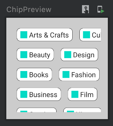
StaggeredGrid {
for (topic in topics) {
Chip(modifier = Modifier.padding(8.dp), text = topic)
}
}
}
}
첫째로, modifier가 UI에 영향을 어떻게 끼치는지 보기위해 배경 색을 변경, 그리고 width와 height가 200dp가 되도록 제한, 마지막으로 text와 주변 사이에 공간을 넣기위해 padding을 추가
constraint가 left-> right으로 전파되기 때문에, 해당 제약을 가지는 ScrollableRow의 content는 200-16-16 = 168 dp로 measure됨
최종적인 ScrollableRow의 사이즈, modifySize 체인이 오른쪽->왼쪽으로 수행된 이후에는 200x200dp 가 됨
| size(200.dp).padding(16.dp) | padding(16.dp).size(200.dp) |
|---|---|
 |
 |
만약 modifier의 순서를 바꾸는 경우(padding먼저 이후 size) 다른 UI를 얻음
이 케이스에서는, the constraints that ScrollableRow and padding had originally will be coerced to the size constraints to measure the children.
따라서 StaggeredGrid 는 200dp 로 제약됨, padding modifier는 사이즈를 (200+16+16) = 232로 키움
232x232dp가 ScrollableRow의 최종 사이즈가 됨
Constraint Layout
Row, Colum, Box 대신 사용할 수 있는 좋은대안. 복잡한 레이아웃을 구현할 때 효과적
ViewSystem에서 ConstraintLayout은 flat한 뷰 계층을 만드는 것이 좋기때문에 크고 복잡한 레이아웃을 만들때 권장됨.
하지만, 해당 장점은 Compose에서는 해당하지 않음. Compose도 깊은 레이아웃 계층을 효과적으로 다룰 수 있으므로
Compose에서 ConstraintLayout 은 DSL과 동작:
- 참조는
createRefs()혹은createRef()를 사용해서 만듦. ConstraintLayout내 각 컴포저블에는 연결된 참조가 있어야 함 - 제약 조건은
ConstraintAs()modifier를 사용해 제공. 해당 modifier 는 참조를 매개변수로 사용하고 본문 람다에 constraint를 지정할 수 있게 함 - constraint 는
linkTo()또는 다름 유용한 메서드를 사용하여 지정 됨 parent는ConstraintLayout컴포저블 자체에 대한 constraint를 지정하는데 사용할 수 있는 기존 참조
간단한 예제로 시작:
@Composable
fun ConstraintLayoutContent() {
  ConstraintLayout{
    val (button, text) = createRefs()

    Button(
    	onClick = { /* Do something */ },
      modifier = Modifier.constrainAs(button) {
        top.linkTo(parent.top, margin = 16.dp)
      }
    ) {
      Text("Button")
    }

    Text("Text", Modifier.constrainAs(text) {
      top.linkTo(button.bottom, margin = 16.dp)
    })
  }
}
Helpers
DSL에서 guidelines, barriers와 chains도 지원함. 예시 :
@Composable
fun ConstraintLayoutContent() {
	ConstraintLayout {
		val (button1, button2, text) = createRefs()

    Button(
            onClick = { /* Do something */ },
            modifier = Modifier.constrainAs(button1) {
                top.linkTo(parent.top, margin = 16.dp)
            }
        ) {
            Text("Button 1")
        }

        Text("Text", Modifier.constrainAs(text) {
            top.linkTo(button1.bottom, margin = 16.dp)
            centerAround(button1.end)
        })

        val barrier = createEndBarrier(button1, text)
        Button(
            onClick = { /* Do something */ },
            modifier = Modifier.constrainAs(button2) {
                top.linkTo(parent.top, margin = 16.dp)
                start.linkTo(barrier)
            }
        ) {
            Text("Button 2")
        }
	}
}
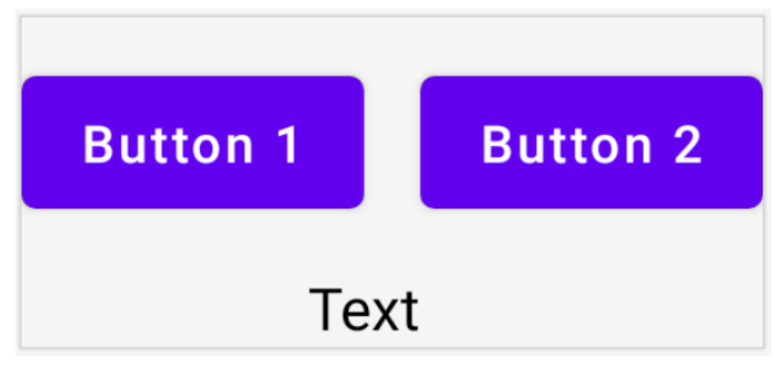
유의
- barriers를 포함한 다른 모든 helpers는
ConstraintLayoutbody 내에서만 만들수 있음.constrainAs내에서는 안됨 linkTocan be used to constrain with guidelines and barriers the same way it works for edges of layouts.
Customizing dimensions
기본적으로, ConstraintLayout 의 자식은 content를 warp하기 위한 사이즈를 선택할 수 있음
예를들어, 텍스트가 너무 긴 경우 화면 밖을 넘어갈 수 있음
width = Dimension.preferredWrapContent 속성을 줘서 넘어가지 않게 할 수 있음
가능한 Dimension 행동들은 다음과 같음:
preferredWrapConent- 레이아웃이 wrap content임. 해당 dimension의 constraint이 적용 됨wrapContent- constraints가 허락하지 않더라도 wrap contentfillToConstraints- 해당 dimension의 constraints에 의해 정의된 공간을 채우기위해 expand됨preferredValue- 해당 dimension의 constraint에 따라 고정된 dp 값을 가짐value- 해당 dimension의 constraint와 관계없이 고정된 dp값
또한 특정 Dimension 은 coerced될 수 있음
width = Dimension.preferredWrapContent.atLeat(100.dp)
Decoupled API
지금까지 예제에서는 constraints는 inline으로 명시됨. composable에 적용되는 modifier와 함께
그러나 레이아웃에서 constraint를 분리하여 유지하는 것이 유용할 때가 있음
- 화면의 configuration에 따라 constraint를 쉽게 변경하기위해
- 두개의 constraint set 에 애니메이션 추가
이러한 케이스들을 위해, ConstraintLayout 을 다른 방법으로 사용할 수 있음
ConstraintSet을ConstraintLayout의 파라미터로 넘김layoutIdmodifier를 이용해서ConstraintSet에서 생성된 참조를 composable에 할당함
@Composable
fun DecoupledConstraintLayout() {
    WithConstraints {
        val constraints = if (maxWidth < maxHeight) {
            decoupledConstraints(margin = 16.dp) // Portrait constraints
        } else {
            decoupledConstraints(margin = 32.dp) // Landscape constraints
        }

        ConstraintLayout(constraints) {
            Button(
                onClick = { /* Do something */ },
                modifier = Modifier.layoutId("button") // decoupledConstraints에서 생성
            ) {
                Text("Button")
            }

            Text("Text", Modifier.layoutId("text"))
        }
    }
}

private fun decoupledConstraints(margin: Dp): ConstraintSet {
    return ConstraintSet {
        val button = createRefFor("button")
        val text = createRefFor("text")

        constrain(button) {
            top.linkTo(parent.top, margin= margin)
        }
        constrain(text) {
            top.linkTo(button.bottom, margin)
        }
    }
}